Please feel free to use any of the vintage images on the website in your artwork. Be sure to share your artwork with us. This is a labor of love and I love to see what you create. Please do not post the original unaltered image on the web but post your artwork and link back to this site for the original image. Please do not sell or post the image alone or in a collection without my permission. Thank you. I can't wait to see what you create!


Tuesday, February 23, 2010

Digital Two for Tuesday 37


We are expecting snow again today. So I thought I would warm up your day with two beautiful images of children cooking. They are both from a vintage magazine from the 20's. Our guest designer this week Maxine has done an amazing job working with these images. Her playful style mixed with vintage is an award winning look. I hope you will be inspired to take part in this weeks challenge and use one of these images in one of your projects. Please make sure you post a link in the comments section so we can all enjoy you work.
Here is Maxine our guest designer's bio in her own words.
"From a very young age I have been interesting in 'making things' - this was channeled into sewing as I grew up, specifically tailoring, making all my own clothes, and then sewing for the family when they arrived, this also included embroidery where appropriate on the clothing. Later I took up embroidery to a much greater degree, then changed tack and started to make bobbin lace in addition to knitted and crocheted lace.

I first started stamping ten years ago when a friend introduced me to the craft as part of her launching a stamp making company. I had a few lessons from her, and then puddled, along pretty much on my own, using magazines and the occasional stamp or craft show for instruction and inspiration for the next eight years. Then I found Splitcoast Stampers and we got broadband, and the revolution started! It is very interesting seeing how my card making has evolved as I have kept a fairly comprehensive gallery of my work on the computer - I cringe when I look at some of my early cards!

I am basically a CAS card maker, but can add the layers and embellishments when I am in the mood.

Cora said that she gives us images to work outside our comfort zones. I enjoy a challenge so I was not unduly worried, until these images arrived. I realised then that I have not had 'people images' in my cards other than one stamp image that I have!! I find it is better not to try and work on a challenge immediately, so I let my mind 'simmer' over them for a while, then inspiration finally arrived!

I coloured the images using chalks, and to highlight the children I used a blender pen to strengthen the colours.

In the card with just the boy cooking, to give a focal point I printed the image twice and cut the boy out and popped him up on foam tape. I had come across the quote and could not resist using it here. The edges of both the image and the quote were sponged with Tim Holtz distress ink - Tea Dye. The green striped paper was sponged with Memento Bamboo Leaves. The brown layer was also sponged with the Tea Dye ink, and the ribbon and star clip added before being mounted on the dark, Evergreen base card.

The 'window' concept arrived out of the blue, and thankfully it was not too difficult to construct - again because I had given myself time to think things through. The lace I used for the 'curtain' was some I had in my stash, and I found it framed the window perfectly. I mounted the finished window scene on the black for definition, as I find the black can make an image 'pop', and I wanted it to be clearly defined from the background. I left the base of the black card long and placed the wide lace across that, adhered the whole onto the base of craft, having sponged the edges with the Tea Dye ink, which softened the whole look. The black half pearls were added last."
You can see more of Maxine's work at her blog.

Saturday, February 20, 2010

Check out Clearly Vintage

I just wanted to let you know I have posted a bunch of B&W images over at Clearly Vintage this week. They are wonderful images from an old seed catalogue. I don't know about you but I am dreaming of a garden this summer. Also here is link to whole group of Peter Henderson seed catalogue covers. They are not B&W but I thought you all would enjoy seeing them. This is a link to the Smithsonian site with over 10,000 seed catalogue images. So make sure you explore the site. You will be in awe. I hope you enjoy. I know I copied dozens before deciding I could alway come back and copy more. Perhaps some of you that are good with graphics could make a few of these into digital stamps for all of us. I think I see a challenge in our future using all of these wonderful catalogue images.

Tuesday, February 16, 2010

Digital Two for Tuesday 36


Well I don't know about you but I am tired of snow. Last week I was on a business trip outside of Washington DC and got stuck in a hotel room for two days. It was a Marriott Courtyard and they only served breakfast. So I ate a lot of candies and stuff from the market. Anyway, I think it is time to think about flowers and Spring. This week our images are from a children's book from the 1920's. I just love these fun images of flowers. I hope you will take the challenge and create something wonderful to share with us. Please post a link in the comments section of this post so we can all be inspired. I know that these images are a little harder to use than those cute children images but our hostess Doreen did an amazing job with them. Doreen has only been papercrafting for a short time but you would never know it from her beautiful work. She is truly talented. Here is her bio and a description of her projects in her own words.


"Hello I'm Doreen. I live in Sheffield UK with my husband of 41happy years, I have three children who have now flown the nest and 2 grandchildren. I have only been making cards since May of 2009, I have never done any crafting until then and it all happened because I decided to tidy the loft and get the old photos out to have a look. I decided they needed to be put into new albums. I then thought I would sort them into scrap books and journal them for future generations. I have now made 10 scrapbooks.
When the photos came to a stop I decided I was having so much fun and I had all this gorgeous stash left over, I wanted to carry on crafting and so I started making cards. My husband has turned our spare bedroom into a craft room, and I am crafting every spare moment I get. I haven't decided what technique I like best I still haven't tried them all, I am enjoying stamping at the moment.

The yellow Daisy card
I decided to add a frame around the image using My Craft Studio, the backing paper I printed from a Joanna sheen Cd, I have matted and layered both the image and the backing paper with a gold linen card and also some cream card, the image I coloured with pro markers added some brads, gems and ribbon.
The Yellow Lady
I decided to cut the lady out, coloured her with my pro markers and found some nice vintage backing paper from a Joanna Sheen Cd along with an image of a vintage seed packet I matted and layered these added some gems, ribbon and a computer generated sentiment. My idea was to keep the vintage look, and I feel I have achieved that."
Doreen
http://doreensdream.blogspot.com/

Sunday, February 14, 2010

Valentine's Day Cutie Challenge


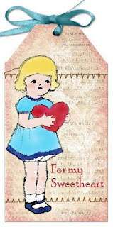
Happy Valentine's Day! Here is a Valentine's Day cutie for all of you. She comes from an awesome magazine I found last year at the flea market called John Martin's Book The Child's Magazine from February 1929. Almost every page has an amazing illustration. I have posted a few other images from this magazine on the Clearly Vintage Valentine's Countdown. My challenge to you is to make a tag using this cutie. If you do, I will add it to this post, so we can all see it. So today whoever takes the challenge will be the guest designers. In order to enter your project email me a photo at coraharkins@sbcglobal.net. I can't wait to see all the beautiful tags. This challenge is over Monday night. So be quick.


Tuesday, February 9, 2010

Digital Two for Tuesday 35


The two images this week represent winter and summer. They both come from a children's book from the 1900's. With all the snow they have been getting in the mid- atlantic USA I thought some may be thinking of winter snowball fights while others are dreaming of summer fun with friends.
Our guest hostess this week is Esther. This is her second time hosting on Digital Two for Tuesday. Again she has created for us some inspiring cards. I just love her use of texture and embellishments. I can't wait to try her idea of using an edge punch to create a lace ruffled frame in the last card. You can see more of Esther's work on her blog Shore Girl Creations. Without further ado here are Esther's beautiful cards.

Snow Day
I used Crayola markers on it
Cut it out with Circle Nestabilities
Matted it with Petite Scallop Nestabilities
Embossed the pink cardstock with Swiss Dots Embossing Folder
Inked over the dots with navy ink
Punched/Attached small snowflakes
Tied Gauzy ribbon on top and attached a hat pin done up with misc. beads
Attached Stone Sticker to bottom right corner w/a bit of fiber tied through hole

The Sea
On white cardstock I stamped and embossed (with black embossing powder) the
ship/sea gulls (Coastal Set - Inkadinkadoo)
The sentiment is from the same set --stamped on the bottom of card with Versa Mark
Using chalks I chalked brown on the bottom/med. blue for water/light blue for sky
Embossed w/Swirls Embossing Folder
Colored image with Crayola markers/matted on red cardstock - attached to card

Rose Card
Emboss cardstock with textile embossing folder
Cut pink strip of paper and run through paper crimper -- attach to middle of the card
1/2 of paper doily on right side of card
Rose image printed from http://www.birdscards.com/ - four times on pink cardstock
Embossed w/transparent embossing powder -- cut and layered
Tag - Provo Craft die cut
My Friend stamp - Studio G
Image colored with Crayola markers

Yellow Flower Card
Image colored w/Crayola markers
Cut two or three strips of yellow cardstock 11 inches long x 1 inch wide
Punch with Martha Stewart lace border punch
Run through paper crimper
Attach around the image to form a frame of sorts - folding and "pinching" along the way
Flower - Provo Craft die cut
Leaves - Cuttlekids die cut
Flower/Leaves/Cardstock embossed with Swiss Dots embossing folder


Tuesday, February 2, 2010

Digital Two for Tuesday 34


Every week I task a guest designer with making a project with one or two images. This week I challenged our guest hostess Juliet to make something with 72 images. She didn't let us down and has created a beautiful project that is sure to inspire you to take the challenge. When I first saw the purse she created, all I could say was wow. Make sure you visit Juliet's blog Ballpoint Bliss to see more of her exciting projects and cards. Here is her description of her project and her bio in her own words. " When I saw these two images, all I could think was INCHIES! Each image has 36 squares ready to print and cut for inchies. With a little juggling, I was able to print all 72 on a single sheet of paper. I first tested my margins on a sheet of plain white copy paper, to see if they would all fit, then whipped out a sheet of Poison Ivory Incandescent (http://www.papertemptress.com/ ). The Incandescent papers have an interference finish which makes the paper seem to glow, even through the coloring.

It might have been boring coloring 72 different images, but I kept switching it up - alcohol markers, water-based markers, pencils, glaze gelly pens, metallic pens, glitter pens, pencils, and a couple dozen which were not colored, but burnished with Tim Holtz distress inks (this was on my plain white test sheet - my incandescents were already cut apart at this point, and too small to hold down and burnish). Some of them were left square, others were punched, fussy cut, trimmed for layers, and most of them were finished on the edges with leafing pens.

A lot of people ask me what I do with inchies. I swap a lot of them online, and I like playing with my little collection the same way a toddler likes to play with blocks - sorting, stacking, and mostly just getting inspired by them. Sometimes a cluster of them will "ask" to be arranged together on an ATC or larger card. These little gems wanted to be walked about - I was able to fit 63 into the 8x10 pocket of my memory purse. "

Bio: Juliet Arrighi is currently trapped by snow in her colonial house in Northern Virginia. She lives there with her archnemesis, the last of her four demon spawn, an arthritic cat, two passionate parakeets, and a drowsy snake. She works as a freelance digital artist and papercrafts in her spare time.
I hope you take the challenge and create something to amaze us all. Please remember to post a link to it in the comments section of this post so we can all enjoy your creation!!

Monday, January 25, 2010

Digital Two for Tuesday 33


This week we have two images from a book called Santa Claus from the 1870's. I am guessing this as there is no copyright but there are many references to the American civil war a few years before. Our guest host this week is Pauline. Pauline has been a follower of my blog for some time and I always love to stop by her blog to see what beautiful creations she has made lately. She has an amazing sense of color. I just love the vibrancy of her work. Here is her bio in her own words. "I'm Pauline, from Stawell, Victora, in the south east of Australia. I am married with a special needs foster child who has multiple disabilities, and an addicted papercrafter! I love cardmaking and scrapbooking. I started scrapbooking, and moved over to cardmaking - I made all my wedding invitations, thank yous and place cards... what an adventure that was! From there I was hooked. My favoured mediums for many years has been rubber stamping, paper folding and piecing, then I discovered card embroidery.... for many years now I have designed my own stitching patterns when commercially available ones didn't suit my need. Then I just started designing them for the fun of it all! I like may styles but am quite finicky with my stamp images I use... I rarely stay in the one genre - I like some realistic, whimsical, cute (but not too cute!) wood cut (I guess the list is endless!) Last year I discovered digital stamps.... and started playing with vintage photo images. So I guess my 'style' could be called 'eclectic' ... as I don't quite seem to fit into any category.

My favoured colouring mediums are markers, H20s, and chalks. My favourite embellishments are lace, ribbons, paper and silk flowers, buttons, beads and bling!" Here are Pauline's projects. Won't you take the challenge and make something with one of these images. Don't forget to share it with all of us with a link in the comments section of this post.
Mother and Child Card:

I have used Bazzill and DCWV patterned cardstock, layers were edged in antique gold ink. The image has been coloured with H20s, with small accents using Stardust Pens (flowers on Mother's robe). As I got a great feeling of serenity from this image, I didn't want to over embellish, so I have used only a strip of vintage reproduction lace, and paper flowers. The largest bloom is a vintage paper flower, the flat blooms are current productions. I have added only a couple of rhinestone brads, and a decorative paperclip which says "Baby


Flower Boy Card:
I have used Bazzill and DCWV patterned cardstock. I coloured the image entirely with chalks, except for the flower in his hand, on which I used Stardust pens. I thought this image was perfect for a Thank You card, so that was the road I took - a simple sentiment was all that I thought necessary.
You can see more of Pauline's talent at her blog My Paper Playground.

Monday, January 18, 2010

Digital Two For Tuesday 32


This week I have two very different images for you. They are from a very old book called Santa Claus from the 1880's. There are so many fun line drawings in this book. I just love the frog images. You can do so much with them. Hopefully, I will find some time to photograph my cards from this week's images and post them on my site Paper Flowers. I'm so busy posting images I never get around to photographing my projects.
Ok, so our guest designers never cease to amaze me and this week's hostess Kym is no exception. I gave her two very diverse images and she created two very exciting cards. Here is her bio in her own words. "My name is Kym and I am a wife and mum to two boys aged 17 and 13. I took up cardmaking in December 2004 by cutting up my previous years’ Christmas cards, sticking on a card and adding an embellishment. I cringe when I think back then and that I gave these kinds of cards to people!! In January 2005 I was in hospital for 7 weeks and then off sick a grand total of 11 months. It was during that time off I came across Dawn Bibby and her shows helped me through a difficult time. It also made me decide that all the cards I make I would give 50% of everything made to charity. I have come a long way card-wise since then and at the beginning of December I celebrated raising £1,000 for many different charities in 4 years by the selling of my cards. That was a highlight for me in 2009 and another one was that I actually got to meet Dawn Bibby in her shop when my husband took me away for my 40th birthday. It made the time away even more special. I so enjoy making my cards and enjoy taking part in challenges as I am always being taken away from my comfort zone. This is my first ever guest appearance and I feel very proud and excited. I hope you like what I have made for you. If you would like to see more please visit me at http://kyms-crafty-cards.blogspot.com/"


The image has been imported into My Craft Studio (MCS) and I put some frames around it and a backing sheet from Walk in Wonderland and printed out. The image I coloured in with Promarkers and used Sakura Clear Stardust pen (no700) to accent the image in places and I did some faux stitching around the edges of the frames. I rubbed a piece of Coredinations card stock with an emery board to age/distress and then scraped along the edge with a craft knife to distress it/make it ragged. I did the same with the digital image sheet. The Coredinations card stock I stamped around with a Kay Carley flourish stamp and Crimsen Red Versafine. I then wet the edges of both sheets with Versamark then put on gold embossing powder and heated it up. I then put the card together with a bow pinched from a box of chocolates we haven’t even eaten yet (don’t tell on me!!!), some glittery gemstones, some card candy and finally some lace with was originally white but didn’t fit in with the colour scheme so I coloured in with my Umber Promarker.


I found four different but toning backing colours in My Craft Studio and layered it all up. I added a flourish in each corner and then placed the flower image in the middle. I then printed it out and coloured in the image with Promarkers using a mixture of pinks/light purples for the flowers and I used a gold Sakura pen for the stamens. I then printed out the backing paper from an Artylicious Damask Delights CD onto a purple pearlescent paper which made it very faint but this was the effect I wanted. The main image was decoupage and then put on some gold mirror card and 3d foam pads to elevate for more dimension. The card was then finished off with some card candy, a ticket sentiment and some purple fibres.

Friday, January 15, 2010

Guest Designer's Wanted


Have you always imagined yourself as a guest designer. So now is your time to shine. You should be a guest designer at Digital Two for Tuesday. I am looking for guest designers for the following dates May 25 and June 1. You will be assigned one Tuesday to wow us with a creation. This is an open call so everyone even previous hosts can answer it. If you are interested in being a guest designer for Two for Tuesday please contact me with a link to your blog or a website where I can see your work at coraharkins@sbcglobal.net. I will then let you know which of the dates you will be assigned. All are welcome. That is what Two for Tuesday is all about trying new things. Your duties will include making a project with one or both of the images from the challenge, a short description of your project,a short bio and to comment on anyones card who participates in the challenge as we all like praise. I will give you the images one week before. They are my choice and sometimes they are different then your usual style. That is part of the challenge. I hope you decide to be a host. Please email me for more information.

Monday, January 11, 2010

Update My Etsy Site

I have updated my Etsy site for my stamps. So please check it out. Clearly Vintage Stamps

Digital Two for Tuesday 31


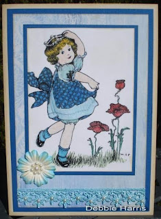
This week's exciting guest designer Debbi Harris is from South Africa. She has an amazing use of color and texture in her work. I love all the accents she adds to her cards. Here is her bio in her own words."This is my first guest appearance which I am thrilled about. I am a proud wife and Mom to 2 gorgeous children. My son Nic is 13 years old and daughter, Sasha is 11 years. I live in fabulous, sunny Cape Town in South Africa. Rubber Stamping has been a passion of mine for the past 14 years and I have hosted many swaps on our South African Internet group. I enjoy making cards, ATC's, Inchies, Twinchies, Moo's and chunky books. My blog is http://dkhdesigns.blogspot.com/ if you would like to see more of my artwork, please leave a comment if you visit."


I have coloured the image with Aquarelle pencils blended with a Dove blender and embellished with flock and Stickles glitter glue. The background has been sponged with Distress Ink Antique Linen using Inkssentials Ink blending tool. All the edges of the layers of card have been sponged with Brilliance Pearlescent chocolate. The image is mounted onto brown card and then onto 2 layers of scrapbook paper and then matted onto another layer of the brown and finally onto a cream folded card. The card is finished off with a cellphone sticker.


I have coloured the image with Aquarelle pencils blended with a Dove blender and the fairy's crown is embellished with self adhesive pearls. The background and the edges of all the layers have been sponged with Distress Ink Antique Linen using Inkssentials Ink blending tool. The image is mounted onto dark turquoise card and then onto a layer of scrapbook paper and then matted onto another layer of the dark turquoise and finally onto a beige folded card. The card is finished off with turquoise lace and a paper flower that I have embellished with pearls as shown in the photo.

Exciting News

Guess what? I was interviewed for a short article on how to pick a photopolymer stamp manufacturer awhile back and I just noticed it has been posted. Share my 2 minutes of fame here at ehow. Also I have put all of my stamps back in my Etsy shop. So be sure to check out all my stamps. If you prefer your stamps sent our first class mail email me for an invoice at coraharkins@sbcglobal.net.